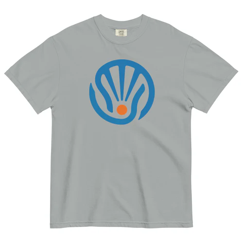
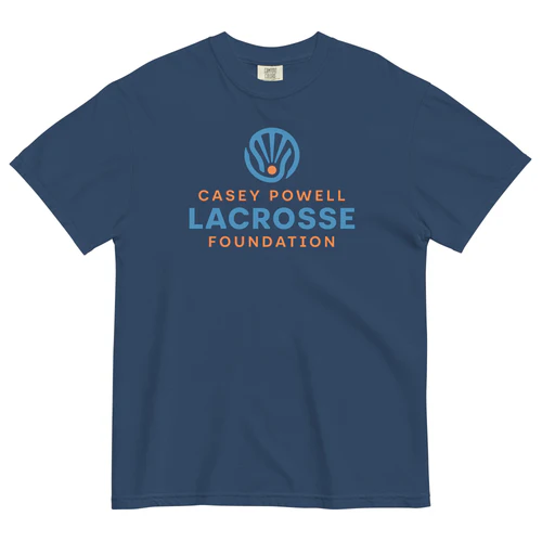
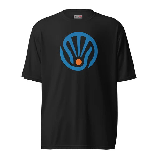
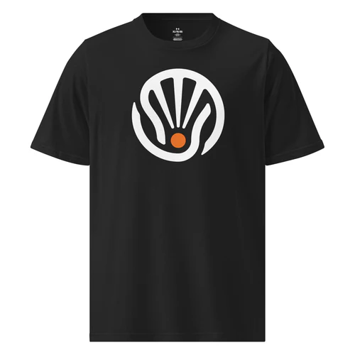
The Casey Powell Lacrosse Foundation’s new logo, designed by Jackson Hallman, is more than just a visual mark – it’s a reflection of our mission and values. Drawing inspiration from the shape of a lacrosse head, the design is centered around three bold lines that represent our core pillars: Share. Support. Inspire. At its base, a bright orange circle symbolizes both a lacrosse ball and the rising sun — a universal emblem of hope, vitality, and the promise of new beginnings.
What began as a simple sketch evolved into a powerful symbol of community and compassion. The logo is open, inclusive, and ever-growing — much like the game of lacrosse itself. It embodies our commitment to supporting lacrosse players and families navigating injury, illness, and recovery, while also promoting the growth of the game in underserved regions worldwide.
This emblem’s story lives in every piece of merchandise we offer. When you wear it, you become part of that story—showing that the lacrosse community stands together, sharing strength, supporting those who need it, and inspiring hope both on and off the field.